Organizing Your Figma Files: A Comprehensive Guide
Written on
Chapter 1: Introduction
Maintaining focus and structure while working on Figma files can often be challenging. The constant search for optimal solutions frequently leads to rearranging flows and pages. A lack of organization can create chaos, hindering your workflow. This guide outlines effective methods to structure your design files efficiently.
While these techniques are based on my personal experiences, it's important to note that every designer and team has unique workflows. Feel free to adapt these strategies to better suit your needs. Proper organization of Figma files is crucial, especially since they are often referenced by product managers, developers, QA testers, and other designers.
Section 1.1: Structuring Your Pages
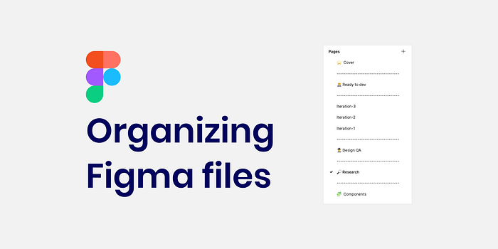
One effective way to organize a page is by dividing it into distinct sections:
- Cover Image
- Ready for Development
- Iterations
- Research
- Design QA
- Components
- Design Decisions (Optional)
Let’s explore each section in detail.
Subsection 1.1.1: Cover Image

This is where you place the image that will be visible on the main page of your Figma project (often referred to as the Figma project manager page). It helps you and your team quickly identify the desired file.
What should be included on the cover?
The cover should provide key information that allows others to understand the file's contents. This includes:
- Feature or Project Name
- Jira Ticket Number
- Start Date
- Current Status (e.g., Research, Design, Ready for Development, Done)
- Lead Designer's Name for easy contact
What is the recommended size for the cover?
A cover image size of 1600 x 960px is ideal, though you can use different dimensions as long as you maintain a consistent background color that matches the cover artboard.
Tips
- You can download cover images from the community; here’s an example of one I uploaded.
- Ensure the cover image page is at the top of the hierarchy to appear as a thumbnail.
- Opt for a solid color background for better readability from the project manager page.
- Adding the cover as a component in your design system can streamline its use.
- Create status components with variants for easy updates.
Section 1.2: Ready for Development
This page should contain only the necessary information for the design handoff to development. Ensure all screens are built using components and are error-free.
Tips
- Simplify explanations for developers with clear flow diagrams, labeling each one descriptively.
- Include notes below screens to clarify complex details, and consider using voice memos for additional context.
- Demonstrate user flow interactions clearly, possibly using plugins like Overflow to add arrows or icons.
- Name each artboard descriptively, avoiding generic titles like "Untitled."
Chapter 2: Iterations and Feedback
In this section, document your design iterations and testing processes to pinpoint the best solutions. Typically, multiple iterations will need dedicated pages.
I share my designs with the team during this phase, gathering feedback and making adjustments based on their input. Each iteration should be distinctly numbered for clarity.
Tips
- Label iteration pages with numbers, like Iteration-1, and optionally, include a date.
- Clearly organize screens and flows, using visual indicators (like red dots) to highlight areas needing discussion.
Section 2.1: Research and Inspiration
Gather and compile insights from team members, users, and online sources within the Figma file. This practice helps centralize all relevant information, making it easier to reference without leaving the platform.
Subsection 2.1.1: Design QA
After implementation, use this section to document your design quality assurance findings, highlighting any discrepancies between design and development.
For effective communication with developers, include comparative images of errors and the correct designs.
To deepen your understanding of design QA, refer to my related articles.
Chapter 3: Components and Documentation
In this section, you’ll add any new components you’ve created, in addition to utilizing existing ones from the design system UI kit.
If you choose not to integrate a new component into the design system, you can keep it here. Remember, Figma allows you to copy components across files without losing their connections.
This video demonstrates how to manage your components effectively.
Design Decisions (Optional)
Documenting design decisions can be useful, although I prefer to keep this outside of Figma since it serves more as a design tool than a documentation platform.
Additional Tips
- Name your Figma files clearly for easy searching; include the ticket number and feature name.
- While layer naming is less critical when using components, ensure the components themselves are well-structured for clarity.
- Consider adding emojis to make your files feel more inviting.
- Use empty pages as separators for better readability.
Creating a Template File
Establish a template file in Figma for team members to replicate, ensuring consistency in structure.
Team Alignment
It's vital for all designers to adhere to a common structure to facilitate collaboration. Workshops can be beneficial in creating a unified approach.
Product Team Awareness
Share your organizational structure with the product team, including product managers and developers, so they can easily find relevant information.
Conclusion
This guide provided insights into organizing information within Figma, outlining a structure that includes:
- Cover Image
- Ready for Development
- Iterations
- Research
- Design QA
- Components
- Design Decisions (Optional)
Keep in mind that every designer and team operates differently, so feel free to adjust these suggestions to best suit your workflow.
Enhance Your Figma Skills
For personalized tutoring, whether you’re a novice or looking to refine your skills, reach out to me. Together, we’ll boost your confidence and proficiency in Figma.
Thank you for reading! If you found this guide helpful, consider sharing it with colleagues or friends. Should you have any questions, please don't hesitate to ask. For updates on my articles, follow me and subscribe!